What’s your nonprofit’s magnetic personality?

From Blah to Bold: Winning Font Combinations to Level-Up Your Website

Fonts are a great way to strengthen your nonprofit’s visual brand, but with so many options it can feel overwhelming to know which combinations are right! In this blog post, HeartSpark founder Lauren Atherton shares practical tips on how to pair fonts well, where to find her favorite fonts for free, as well as a few winning samples to help your nonprofit level up asap.

Illustration of four people standing on blocks that represent different Google Fonts. The four individuals are "building" winning font combinations by connecting blocks together.

Being a professional designer comes with many natural advantages, but one of the blessings/curses is you’re constantly critiquing design in the wild. And after years of noticing every bit of design, from a billboard to an email signature – I have to admit I’m a bit of a font snob.

Too many nonprofits aren’t taking advantage of typography and it’s leaving their style feeling, well, boring and forgettable. I want this post to be really practical and easy to implement asap, because taking your style from blah to bold is a task that can be considered low-hanging fruit for your org. You don’t have to go crazy with a bunch of different fonts or get in the weeds like I tend to do with my font snobbery. But there are simple steps to level up so your nonprofit doesn’t get passed over or ignored and refresh your brand

Here are 3 simple steps to take your fonts from boring to bold: 

1. Know When It’s Time to Upgrade

If your nonprofit is using standard fonts like Lato, Calibri, Myriad Pro, Arial, Verdana, or Times New Roman – it’s time to level up. There are thousands of fonts available to use for your nonprofit, including some really great choices that are available for free!

My top 3 resources for free fonts:
  • Adobe Fonts – If your nonprofit uses the Adobe Creative Cloud, then you have access to this free library of some of the best fonts from world-renowned type foundries. 
  • Google Fonts – Free to access and download any font in their library. 
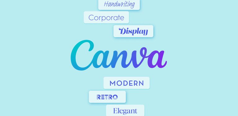
  • Canva – Licensed fonts are available right inside their platform. These are some top-notch paid fonts, but be sure to check that you can access the font outside of Canva. 

In my opinion, the two best places to download or use free fonts are Google Fonts and Adobe Fonts. Both are completely free for your nonprofit to use and make it easy to access some of the world’s best font foundries. Yes, there are entire businesses dedicated to designing and distributing typography – wild, right?!

2. Start with One

A quick win is to update your headline font – typically this is the larger text on your website or large text you put onto social graphics.

Let’s review the 6 basic varieties of typefaces:

  • Traditional Serif: Named for the little mark at the end of each character’s stroke. Serifed fonts feel classic, stable, refined, and luxurious.
  • Slab Serif: Follow the construction of a sans serif font, but have serifs with the same weight as the base character. These fonts feel friendly and hard-working. 
  • Sans Serif: A typeface designed without serifs (sans = French word for ‘without’). This typeface feels modern, sophisticated, clean and simple.
    1. Condensed: Industrial, strong, bold.
    2. Humanist: Relaxed, approachable, contemporary.
    3. Grotesque: Structured, flexible, hard-working.
  • Handwriting: Typefaces that mimic human handwriting. These fonts should be used sparingly because they can be tough to read. They add a creative, casual, and fun feel to your brand.
  • Display: Typefaces that are intended for use in a title or heading. They typically have more detail and personality so need to be larger for legibility. These fonts feel bold, modern, and fun. 
  • Monospace: All the characters occupy the same horizontal space. These fonts typically feel more analytical and cold, but can add a touch of forward-thinking to your brand.


Many nonprofits stick with basic sans serif fonts like the ones I listed above (Lato, Arial, Tahoma, Open Sans, and Verdana) which are great for legibility, but are so overused that they don’t have any impact when you see it in your brochure or on your website. 

3. Choose a Winning Combination

Consider pairing your current sans serif font with a bold Display or Condensed typeface. This will allow you to keep the advantages of a legible font with a really strong headline font. Check out a few examples (with links to the Google Font family) below:

Fjalla One + Arimo

Oswald + Work Sans 

Barlow Condensed + Barlow

Climate Crisis + Open Sans

Changa One + DM Sans

Titan One + Lato

Roboto Slab + Roboto

Fira Sans Bold + Inter

Poppins + Figtree

Arvo + Montserrat

Playfair Display + Fira Sans

Domine + IBM Plex Sans

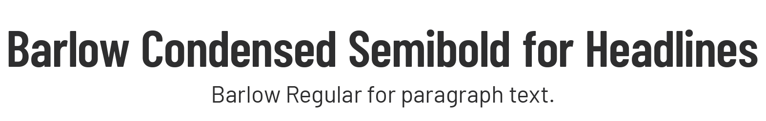
Merriweather + Merriweather Sans


Quick word of caution if you’re looking for another pairing on your own: try not to pick a font that’s too stylized or kitschy – the font should still underline your credibility, not distract from the rest of your brand style. If the font only has one weight, that’s typically a sign that it’s not a good font to choose. We want fonts that at least have an italic weight and/or regular or bold variations. 

I typically advise against free type foundries like UrbanFonts, 1001 Free Fonts, or Dafont – while there are a lot of options, they’re not all tested and can be made by amateurs. Sometimes these fonts do not contain the full family and have poor readability. Choose a font that will complement your new logo, as well as help ladder up to the overall brand personality. Try using the font with your color palette to really see it come to life. 

Fonts are a great way to strengthen your graphics, but with so many options it can feel overwhelming to know which ones are right! While this post is designed to give you a quick level-up for your brand style, the most successful font combinations are aligned with your nonprofit’s personality and purpose while building an effective brand.

This is something we can tackle together in the Brand Level-Up, my done-for-you branding service where we’ll tackle your logo and visual brand, marketing templates, and website design in just 90 days. 

Here’s your first step: Book a free consultation call with me. In 25 minutes, we’ll…

  • Review your current logo and give you a free mini audit of what’s working (and what’s not)
  • Pinpoint what’s holding your brand back and outline your next best steps
  • Help you decide if HeartSpark is the right fit – and if not, I’ll connect you with someone who is!

Discover your *magnetic* brand personality

Take the free Brand Personality Quiz to uncover what makes your nonprofit organization irresistible to donors.

Related Resources

For more insights on brand strategy and marketing, explore these articles:

Brand Strategy 101: Strengthen Your Nonprofit’s Identity and Impact

Brand Strategy 101: Strengthen Your Nonprofit’s Identity and Impact

A clear brand strategy is essential for communicating your mission, building trust, and standing out in a crowded space. This…
Questions to Prepare Your Team for a Smooth Branding Project

Questions to Prepare Your Team for a Smooth Branding Project

Prepare your nonprofit for a rebrand with clear goals, budget, and image. This checklist will align your team so you…
Canva Fonts: Accessible & Stylish Choices for Nonprofits

Canva Fonts: Accessible & Stylish Choices for Nonprofits

Building graphics in Canva is about more than just looking pretty – it's about inclusivity. Show off your brand personality with these…
Radio Categories
Branding and marketing are often lumped together, but they serve two very different purposes. In this post, you’ll learn the real difference between branding and marketing, why the order matters, and how to set your organization up for more powerful, consistent, and aligned communications.
If talking about your nonprofit feels confusing or unclear, you’re not alone. The SPARK Strategy is a simple, powerful framework to help you confidently communicate your mission, connect with the right people, and inspire more support. In this post, I’ll walk you through exactly how it works and how to get started.
This post breaks down 5 smart strategies to help you build a great nonprofit website, guide visitors to action, and feel proud of how your nonprofit is being shared online.
Not sure when to refresh your nonprofit’s brand and website? In this post, I’m sharing the best (and worst!) times to rebrand plus how to plan around events, campaigns, and busy seasons without overwhelming your team.
If your nonprofit website feels outdated or isn’t converting visitors into donors, these 3 simple fixes can start turning it around. Learn how to turn your site into a fundraising asset today.
If your fundraising feels harder than it should, your brand might be quietly working against you. Watch this quick video to learn how the right brand can help more of the right donors find YOU instead of chasing them.

Stay in the Loop

Get helpful insights, tips, and news delivered right to your inbox.