I’ve just turned the last page of “The Seven Faces of Philanthropy,” a fascinating book recommended by fellow nonprofit consultant Evan Wildstein.
This read delves deep into the world of major donors, categorizing them into seven distinct types:
- Communitarians (26%) “Doing good locally makes sense”
- Devout (21%) ”Doing good is God’s will”
- Investors (15%) “Doing good is good business”
- Socialites (11%) “Doing good is fun”
- Repayers (10%) “Doing good in return”
- Altruists (9%) “Doing good feels right”
- Dynasts (8%) “Doing good is a family tradition”
It’s been an eye-opener, especially learning that among these, only the majority of “Investor” and “Dynast” donors trust philanthropic advisors on where to donate (23%). The rest?
They follow their hearts and listen to instinct.
Now, even though the book zooms in on major donors and has aged over 30 years, it sparks an interesting thought: How does a donor decide where their heart leads them?
Especially when a British poll reveals a whopping “70% of people always trust their instincts” in decision-making. Isn’t that something? 7-0!
Instinct is powerful. Informed by our past experiences and lessons learned the hard way, instincts can dictate decision-making. So can gut feelings, or those subliminal nudges that guide us, sometimes without us even realizing it.
But here’s where it gets interesting: you can use design to influence a person’s instincts.
While we all hope to use design and branding to shine a light on the truth, we can’t ignore the power of the subconscious mind to subtly influence perceptions and emotions. The best brands ring true – and the same can be said for your nonprofit.
Here are some steadfast visual cues we can use to influence “instinctual” decisions:
🎨 Color Psychology
Just like a child’s first exploration of the world through color cues, we can use hues to spark positive associations and feelings towards your cause. Most people don’t walk around consciously thinking about how color affects them, but it actually does influence our attraction to brands – and even the words we use to describe those brands!
🧹 Simplicity
Avoid the clutter! A clean, straightforward design can lead to a positive gut reaction by making everything “feel just right.”
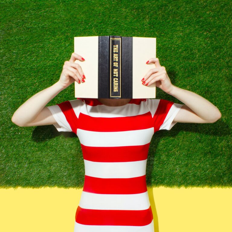
📸 Photography
Capture hearts with images that radiate joy, satisfaction, or relief. Our brains have a special area for processing human faces, which alone gives off hundreds of subliminal cues. This is why it’s so important to use photos of real people – our brains can decode and remember them way better than an illustration or writing alone (over 10,000x faster!)
👍 Usability
A smooth, intuitive experience eliminates mental barriers and helps underline your credibility – so supporting your cause feels like the natural choice.
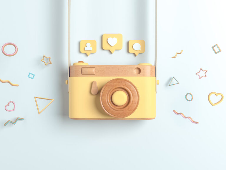
🤝 Social Proof
People look at the actions of others to determine if they’re making the right decision. Incorporate testimonials or user reviews to show the positive impact you’re making. Even though people may not know each other, seeing other take action reassures and inspires trust.
📝 Personalization
Everyone loves to hear and read their own name, right? Tailoring your online donation experience or confirmation emails to reflect the donor’s name, preferences, behaviors, or past interactions will create a more intuitive connection. This helps your donors feel seen, understood, and valued on a subconscious level.