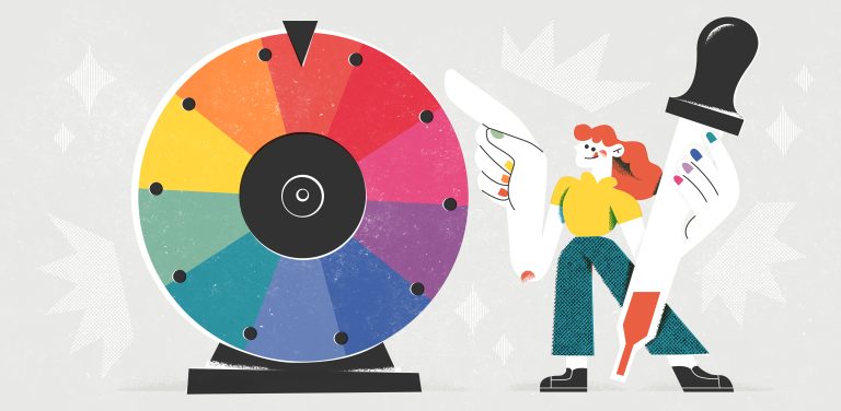
You don’t need to reinvent the (color) wheel when designing your nonprofit’s color scheme! Color already has a wealth of inherent meaning and symbolism that’s rooted in psychology. Use color correctly, and you can capture attention or evoke a specific emotion that speaks to your cause. How does that work? Color psychology stems from our shared experiences with color that are reinforced throughout our lives.
Just think about it—one of the first things we learn as children is to identify colors, and we start associating them with emotions at a young age—like hunger with red, happiness with yellow, green as growth, or blue for stability.
Our personal experiences with color throughout our lives have shaped how we still interpret and react to color today. You have a lifetime of psychological experiences and cultural norms that have done the hard work for you!
Because color has so many associations and can shift between cultures and societies, it is one of the most universal elements in your brand toolkit for communicating feelings and evoking a mood.
Understanding the meanings of colors in our lives will help you strategically attract more attention, and maybe even become recognizable for a specific hue. Brands know what their colors are doing to draw people in and help them feel something, and when we align them with your brand personality, your brand will feel more consistent and credible.
And knowing the meaning behind your colors helps to keep your brand aligned as well. Nothing is worse than having someone argue for a new brand color “just because they like it.” There’s power in knowing the purpose behind your color palette and what emotions it’s communicating to your community.
Quick Color Vocabulary
- Color: The general term for any visual characteristic that the eye can perceive.
- Hue: The dominant color family or pure color, such as red, blue, or green.
- Tone: A hue that has been mixed with gray, dulling the intensity of the color.
- Shade: A hue that has been darkened by adding black.
- Tint: A hue that has been lightened by adding white.
Warm and Cool Colors
Your brand does not have to follow the “warm and fuzzy” nor a “cold and professional” formula for your color palette. In fact, most organizations use a blend of both to get their message across. Warm colors like red, orange, and yellow tend to evoke feelings of energy, passion, and excitement, while cool colors like blue, green, and purple bring calm, trust, and reliability.
Color Meanings & Symbolism
Our eyeballs can detect and identify millions of hues within seconds, which triggers all sorts of associations. Once you understand the psychology behind popular colors, you will start to see them at work EVERYWHERE. It’s pretty amazing how our minds react to color—and we may not even be aware that it’s happening!
Below I’ve shared more details about groups of similar hues and a few quicker details for how color meanings can change even within a range of hues. It’s important to note that these color theories are coming from an American woman’s perspective, so if your nonprofit serves people internationally or in another cultural context, check with your constituents before going all-in on a new color!
Red
Known for: Energy, passion, action, desire, and excitement.
- Deep red: Rich, earthy, robust, mature, elegant, decadent.
- Bright red: Passionate, sexy, energized, courageous, brazen, excited, assertive.
- Bright pink: Playful, wild, romantic, vibrant, exciting, positive.
- Blush pink: Sensitive, soft, childlike, intimate, nostalgic, sweet, natural.

Orange
Known for: Enthusiasm, creativity, warmth, fun.
- Bright orange: Friendly, confident, optimistic, adventurous.
- Burnt orange: Warm, rustic, bold, autumnal, strong.

Yellow
Known for: Happiness, optimism, caution, energy.
- Bright yellow: Joyful, attention-grabbing, energizing.
- Light yellow: Soft, calming, cheerful, welcoming.

Green
Known for: Growth, health, life, nature, peace.
- Olive green: Earthy, traditional, reliable, grounded.
- Light green: Fresh, tranquil, rejuvenating.
- Kelly green: Bold, vibrant, energetic.
- Forest green: Deep, trustworthy, conservative, balanced.

Blue
Known for: Trust, loyalty, stability, calm.
- Deep blue: Serious, professional, authoritative.
- True blue: Honest, reliable, sincere.
- Sky blue: Open, friendly, approachable.
- Sea foam: Light, peaceful, serene.
- Turquoise: Playful, fresh, lively.

Purple
Known for: Luxury, mystery, spirituality, imagination.
- Deep purple: Rich, royal, sophisticated, luxurious.
- Bright purples: Creative, mystical, inspiring.
- Lavender: Gentle, soothing, elegant, calming.

Brown
Known for: Warmth, dependability, earthiness.
- Tan: Neutral, classic, basic, organic, simple, bland, outdoors, nature.
- Deep brown: Strong, grounded, natural, rugged.
- Warm grey: Modern, sophisticated, balanced, timeless.

Black
Known for: Power, sophistication, elegance, formality.
- Rich black: Bold, classic, authoritative, sleek.
- Neutral greys: Neutral, refined, professional, balanced.
- Cool greys: Modern, minimalistic, unemotional, reserved.

White
Known for: Purity, simplicity, cleanliness.
- Pure white: Fresh, innocent, clean, new.
- Cream: Soft, warm, welcoming, relaxed.

Pairing colors together
There will probably be several hues that you see above and think, “that’s the one (or 6!)” But there is an art to pairing colors together in a way that feels harmonious and balanced. Combining primary, secondary, and tertiary colors is the key to creating a dynamic color palette that will help your primary hue shine. It’s important to balance your palette—some colors will draw more attention, so prioritize your color scheme and make sure not all colors carry the same visual weight.
Just like your brand’s message and mission, it’s important to tell one clear story at a time. Choose one primary color and a secondary color that won’t compete with your primary hue. If you use five strong colors all shouting at once, the message will seem harsh—that’s why it’s important to have a balance of light and dark tones.
And look at what other nonprofits in your vertical are using for their color palettes. Sometimes when everyone else is zigging, it can be beneficial to zag! For instance:
- charity:water is known for its bright yellow jerry water jugs in a sea of pure blue water brands.
- Susan G Komen is known for its bright pink ribbons that fly in direct contrast to the cold and professional feel of most healthcare brands.
- The American Red Cross is known for their red cross that has endured for decades, symbolizing urgency and drawing attention to war and humanitarian crises.
And bonus tip: If your nonprofit’s name uses visual language like “water” or “spark” or “red cross” then don’t overthink your color theory. Give people a clear and straightforward message to remember you by. It doesn’t hurt your brand to repeat the symbolism with both words and graphics!
Color Contrast & Accessibility
Contrast is essential, especially for accessibility. Color blindness affects 1 in 12 men and 1 in 200 women (World Health Organization). According to the National Eye Institute, green and red are the hardest colors to differentiate, so always check your designs for accessibility.
It’s also important to remember that people may perceive colors differently than you do. Whether there’s color blindness or different symbolic meaning coming from a distinct cultural context—people can have strong reactions to color, and negative associations may limit their relationship with your brand.
Before publishing a design, run it through Canva’s accessibility checker first. They’ll let you know if your colors have enough contrast or if the text is large enough to read.
Use Your Accent Colors Strategically
A well-balanced color palette can guide people’s eyes across your website, in social media posts, or even encourage them to take action or make a donation. The key is to be intentional and strategic with how and where you use your accent color. Overusing it can dilute its impact and confuse your audience, while placing it thoughtfully can reinforce your message and drive action.
Here are my top tips for where to use your accent color:
- Website Buttons: Use your accent color for important calls-to-action (CTAs). For example, make your “Donate” or “Sign Up” buttons stand out by ensuring they contrast well with the other colors on your site. This will naturally draw attention to the most critical actions you want users to take.
- Headlines and Key Sections: Accent colors can be used to highlight important headlines or key sections of your site. However, limit their use to prevent overwhelming your visitors.
- Social Media: In social media posts, incorporate your accent color to reinforce brand consistency. This helps your content stand out in busy feeds while keeping your posts aligned with your overall brand identity.
- Calls-to-Action in Emails: Just like on your website, using an accent color for CTA buttons in email marketing will ensure they catch the reader’s eye. Whether it’s a “Donate Now” or “Learn More” button, a strategic color choice can make a significant difference in response rates.
Your Brand Colors Can Speak Volumes
Remember, you don’t need to spin your (color) wheels coming up with the perfect color pairing for your nonprofit. Use what you’ve learned about color psychology! Start by aligning your color choices with your core values, evaluate those choices against your competition, and then building a cohesive palette with a balance of light and dark tones.
A thoughtful brand color can convey trust, evoke emotion, and connect with your audience in ways that will help your nonprofit stand out and be remembered.

Lauren Atherton
Discover your *magnetic* brand personality
Related Resources
For more insights on nonprofit branding and website essentials, check out these articles:

Discover Your Brand Personality: An Overview of 12 Archetypes for Nonprofits

How to Perfect Your Color Palette with Balance and Contrast