Canva Fonts: Accessible & Stylish Choices for Nonprofits
-
 Lauren Atherton


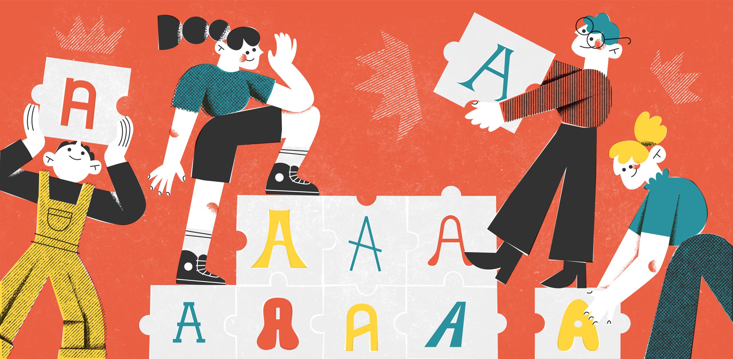
If you’ve ever opened Canva’s font menu and felt your heart skip a beat – you’re not alone! With over 5,000 options to choose from, even for a designer like me, that’s way too many options.
Talk about analysis paralysis… 😵💫
Even with thousands of style options at your fingertips, there’s really just one thing that matters most: can people actually read what you’re sharing? After all, fonts exist for one simple reason – to help us connect with others through our words!
But before you rush to delete all your current fonts or update your brand guideline, let’s talk about how to make smart choices that look beautiful AND are readable for everyone.
Accessibility Matters More Than You Might Think
Here’s something that might surprise you: about 20% of people (one in five) have disabilities or neurodivergence that can make it tricky to read certain fonts online. That means some of your most passionate potential supporters might be missing out on your content simply because of font choices.
When we choose accessible fonts, we’re doing so much more than just “following the rules” – we’re showing people that we’re inclusive, instead of just saying that we are. And here’s a lovely bonus: fonts that are easier to read actually help everyone engage better with your content, not just those with visual challenges. In fact, most people probably won’t even notice that your fonts are accessible.
The secret is understanding that accessible fonts don’t have to be boring – in fact, Canva has a bunch of modern fonts that are also readable. When you choose the right fonts and know how to style them, your materials will look more polished and professional, too.
In this article, I’m going to walk you through:
- How to choose fonts that look great AND are readable (with examples!)
- Simple ways to organize your text so it’s super easy to read
- My favorite tricks for making sure your text pops against any background
- Easy spacing tips that make your longer content more readable
I’m going to walk you through everything you need to know about accessible fonts, starting with how to choose ones that make your nonprofit shine while being easy to read.
4-Step Guide to Accessible Fonts in Canva (No Design Degree Required!)
Whether you’re drafting up social media posts, a presentation, or annual appeal letters – these four steps will help your message be easier to read and look more polished. Once you get the hang of these steps, they’ll become second nature!
Step 1: Choose the Right Styles
Let’s talk about fonts and accessibility – and trust me, it doesn’t have to be boring! While many people immediately think of Arial or Helvetica when they hear “accessible fonts,” there’s actually a whole world of modern, stylish options that are both beautiful and easy to read.
Let’s cover the basic font styles available:
- Sans Serif: Clean and modern fonts without decorative details, like Inter or Roboto, that are perfect for digital screens and make reading easier for everyone.
- Serif: Classic fonts with little “feet” or details at the ends of letters, like Georgia, that guide your eyes smoothly across printed pages.
- Decorative: Fun, stylized fonts that add personality but should be used sparingly – think of them like a bold statement necklace that adds pop to a simple outfit.
- Script or Handwriting: Flowing, cursive-style fonts that mimic handwriting – beautiful for special touches like quotes or headlines, but best saved for shorter text since they can be tricky to read.
- Display: These are the attention-grabbing fonts designed for big headlines and titles – they’re like your “special occasion” fonts that make a statement but aren’t meant for longer reading.
Sans-serif fonts are much easier to read on digital screens. Fonts like Arial, Helvetica, or Calibri are usually recommended but very overused. Opt for Roboto, Inter, and DM Sans instead, and here are a few other winning Google font combinations you can use online! Serif fonts are best for printed pieces like direct mail or brochures.
When you’re reading something on your phone or computer, those little decorative feet on serif letters can get a bit fuzzy and hard to read. That’s why clean, simple sans-serif fonts work so well for websites, social media, and emails.
But you don’t have to stick with the same old boring fonts everyone else uses. There are dozens of modern sans-serif options that look fresh and professional while still being super readable. For example, Inter has become a designer favorite because it looks sleek and contemporary while being incredibly easy on the eyes.
When it comes to print materials though, that’s where serif fonts really shine. The little decorative details actually help guide your eyes along the text – kind of like a built-in reading assistant.
But here’s where people often get tripped up in Canva: they see all those beautiful script, display, and decorative fonts and can’t resist using them. While these fancy fonts might look pretty, they can be really difficult to read, especially for people with visual impairments or dyslexia.
Allow me to get really nerdy for a minute – because a readable font needs several key features to make it easy for everyone to process:
- Clear letter shapes that are easy to tell apart (like making sure ‘a’ and ‘o’ look different)
- Consistent spacing between letters that creates a steady rhythm
- Open spaces within letters (like in ‘e’ or ‘o’) that don’t close up, even at smaller sizes
- Similar heights for lowercase letters
- Predictable widths for each character
- Clear ascenders (like the tall part of ‘h’) and descenders (like the bottom of ‘p’)
One of the most crucial features is a straight, steady baseline – that’s the invisible line where your letters sit. For people with dyslexia, letters can appear to float off or move around when this baseline isn’t stable. Having a strong, consistent baseline helps anchor the text and makes it much easier to read.
When fonts get too decorative or stylized, these important features often get lost. Letters might bunch together, shapes become unclear, or those helpful open spaces might disappear. This is especially true with script fonts, where letters often drift above and below the baseline.
But the good news is that there are so many beautiful fonts available for you in Canva that keep all these readable features! Let me show you some of my favorites:

Pin this image so you have an easy reference for what to look for in an accessible font!
But there’s more to accessibility than choosing the right fonts in Canva. Next I’m going to share 3 more steps to maximize the readability of your designs…
Step 2: Set Your Font Sizes
Think about the last time you opened a newsletter that made you feel totally lost. You know that feeling – when your eyes dart around the page because you’re not sure where to start reading? We’ve all been there!
That’s what happens when there’s no clear hierarchy in your design. Think of font hierarchy like creating a path through your content – it’s your way of saying “Start here, then read this, and here are the details if you want to know more!”

Creating hierarchy isn’t just about making things look neat (though it definitely does that too!). It’s about making your message crystal clear. When you nail this, your readers can either quickly grab the main points or dive deeper into all the wonderful details you’re sharing.
Now, let’s talk about something really important – the World Wide Web Consortium (W3C) created a standard of Web Content Accessibility Guidelines (WCAG) to help everyone build a web consistently and safely. These folks are the champions of digital accessibility, security, privacy, and safety online!
One of their big focuses is making sure people can adjust text size to fit their needs. Specifically, they want text to be resizable up to 200% without breaking. Why? Because everyone reads differently! Maybe your aunt likes to zoom in on her phone to read messages, or maybe someone uses a screen magnifier to see things more clearly. We want to make sure everyone can read your message their way.
While WCAG cares more about resizability than specific sizes, here are the font sizes I’ve found work beautifully in Canva:
- Headlines: 50-60 pixels
- Subheadings: 30-40 pixels
- Body text: 20-30 pixels
- Buttons and links: At least 18 pixels
Let me show you how this looks in real life:

See how the headline stands out at 58 pixels? Then your eye naturally moves to the subheading and text at 28 then 25 pixels, and then the call-to-action is very legible at 24 pixels on a white background. Whether someone’s quickly scrolling through their feed or taking time to read every word, they’ll be able to follow the information.
Remember, these sizes are just a starting point – what really matters is that your community can read your content easily.
Now that you’ve got your font sizes sorted out, let’s talk about making sure everyone can actually read that text clearly! I’ve got a simple trick that doesn’t require any fancy tools…
Step 3: Check Your Color Contrast
Let’s talk about contrast – it’s one of those design principles that makes a huge difference in how easily people can read your content. Think of contrast as how well your text stands out against its background, kind of like how a black pen shows up so much better on white paper than on colored paper.
WCAG guidelines give us really helpful targets to aim for to make sure everyone can read our content comfortably. They’ve actually found a way to quantify the depth of colors so we can compare them to each other. That’s the bonus of using contrast to build a balanced color palette – most of the hard work has been done in advance!
Think of it this way: black text on a white background has a ratio of 21:1 which means it’s super easy to read. Here are the contrast ratios that WCAG recommends:
- Larger text (24 pixels and up), you can go with a 3:1 ratio
- Regular text (anything under 24 pixels): contrast ratio of at least 4.5:1

I know these numbers might sound technical, but don’t worry – there are great tools that do all the math for us. You’ll just need your color hex codes from Canva to test them out. Here are my top 3 tools you can use to check how well your colors are working together:
But my all-time favorite trick is the most low-tech. I like to squint at my design – if the text gets hard to read when I do that, I know I need to boost the contrast.
Remember, good contrast isn’t just about following rules – it’s about making sure everyone in your community can easily read and connect with your message.
Step 4: Set Your Alignment & Spacing
Finally, let’s talk about how much breathing room your words and letters need to be legible – because just like we all need personal space! When we give text enough space, it becomes so much easier for everyone to read and understand your nonprofit’s important message.
Here are five friendly ways to make your text more comfortable to read:
- Line Spacing (Leading): Leading is the vertical space between lines of text. Try setting your line spacing to at least 1.5 times your font size. So if your text is 16 pixels, give it about 24 pixels of space between lines. It’s like creating little pathways for your eyes to follow easily from one line to the next.
- Letter Spacing in Headlines (Kerning): When you’re working with big, bold headlines, give those letters a little extra space – about 1-2% more space between them. This small change can make your headlines so much easier to read, especially for people who might have trouble seeing letters that are squeezed too close together.
- Comfortable Reading Widths: Did you know our eyes get tired when they have to track too far across a page? Keep your text to about 50-75 characters per line (that’s about 8-12 words). It’s like creating a cozy reading path instead of a marathon track! Studies show this can improve reading comprehension by up to 25%. Try keeping your text to about 60% of your image width – your readers’ eyes will thank you!
- Paragraph Breaks: Give your paragraphs room to breathe! Add some extra space between them (about 1.5 times your regular line spacing) to break up your content into bite-sized pieces. Think of it as creating natural rest stops for your readers as they move through your message.
- Natural Text Alignment: While perfectly justified text (where both edges line up) might look neat, it can actually be harder to read. It forces your words to be spread apart unevenly, which can create what we call “rivers of white space.” Instead, try using “ragged right” alignment (like this paragraph). It might look less “perfect,” but it’s actually much easier to read because the spacing stays natural and consistent.
Now you might be wondering…
Do these accessible font styling rules apply to everything digital – even email?
Yes, and email might be one of the most important places to keep your fonts accessible. Think about it – your email newsletter or fundraising appeal might be the main way you stay in touch with your supporters.
And we all know how overwhelming email can get (I just checked my inbox and… yikes!)
When someone opens your email, you want them to instantly feel like “Ah, this is easy to read!” not “Oh no, this is too much right now.” Making your emails accessible isn’t just about following rules – it’s about showing your supporters you value their time and have made complex updates easier for them to understand.
Plus, emails can be tricky because people might read them on all sorts of devices. They could read your email in between meetings on their phone, on a monitor in their home office, or even their tablet before bed. Most email platforms have accounted for this for you, but it’s important to make sure you’re using clear, readable fonts so your email can be resized no matter what device they’re using.
And now there’s the added complication of “dark mode” – people can choose to read your emails with inverted color contrast so it’s easier on their eyes at night.
My best advice for styling emails is to use the closest native font style in your email platform (for instance, my brand font is Inter, but in email I use Roboto) and do not use text over images or backgrounds.
Remember, your message is too important to let font choices become a barrier. When you choose clear, readable fonts for your emails, you’re making sure that everyone can focus on what really matters – the amazing work your nonprofit is doing and how they can be part of it. Whether they’re reading in bright sunlight or dark mode, on their phone or at their desk, your content should be easy to read and understand.
In summary…
Creating accessible content isn’t about following a complicated set of rules – it’s about making sure everyone can easily read and connect with your nonprofit’s message. We’ve covered how to choose modern, readable fonts (no boring Arial required!), set up clear hierarchies that guide readers through your content, and ensure good contrast whether someone’s reading on their phone or computer.
Remember that one in five people have some form of visual impairment, so while your thoughtful font choices might go unnoticed by many, they’re making a world of difference for 20% of your community.
Whether you’re designing social graphics in Canva, crafting email newsletters, or updating your website, each small change you make – from font size to spacing – helps remove barriers between your message and the people who need to hear it.
If you feel like your nonprofit’s brand has stalled out, schedule a free 25-minute consultation call with me. We’ll chat about your goals, ideal donors, and map out the best next action step for your organization.

Lauren Atherton
Discover your *magnetic* brand personality
Related Resources
For more insights on nonprofit branding and audience engagement, explore these articles:
From Blah to Bold: Winning Font Combinations to Level-Up Your Website